Table of Contents
Most construction pros and homeowners may be surprised to learn that among a plethora of influences, aesthetic trends in home exteriors can often be traced back to fashion runways. It seems that we humans prefer to audition color and style choices via our wardrobe selections before making firmer commitments. Interior designers then incorporate mainstream vogue elements into paint color schemes and subtle decorating accents. Eventually, favorable interior features are adapted into exterior design in the form of color, contrast and texture.
When building product manufacturers commit to colors and textures, it’s a big decision, in which timing is everything. Be wary that some so-called trends are just fads that will quickly fade into obscurity. The key is to be just slightly ahead of the market so when the product launches, it is perceived as innovative, yet appealing and accessible to the consumer. If a product is launched too far ahead of the trend, it will fail to generate customer excitement and fizzle out.
This fashion-interior-exterior trajectory makes sense if viewed through an investment and transitory lens. Relatively speaking, on the three-tier design hierarchy, clothing ranks lowest in cost and also has the shortest turnover with styles transitioning from one spring season to the next. Home interiors tend to be more long-term due to higher expenditures and inevitable household disruption. So it follows that home exteriors—being at the highest end of the cost spectrum—will have the longest intervals between changes. In theory, this design-trend pathway allows for clothing to be filtered out at the fashion level—for example, the tie dye motif—while making yet another fashion comeback—mercifully never made it into our living rooms—but shag carpeting did!
Of course, transitions from one stage to the next undergo subtle shifts along the way. A fashion trend might start as hunter green/bold and then become more muted for use in interiors. The same holds true for interior to exterior trends. Navy blue is a big trend in kitchens and bathrooms and a good indicator of what is to come on the exterior.
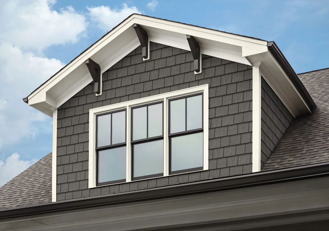
For another early trend indicator, we look to the two most popularly renovated rooms, the kitchen and bath. In both cases, modern industrial with copper and black fixture is leading the way. For exteriors, this suggests a burgeoning shift towards more stark gunmetal grays and black. We may see natural materials like cedar or wood being painted dark colors as charred wood trend begins to catch on.
TandoShake’s Mariner Blue color is a great example of implementing a winning formula for innovative product development. Premiering in 2019, this shade allowed us to ride the wave of this color trend while others struggled to get on board. We could see this pattern enduring over the past few years with the persistent influence of classic blue on interiors particularly kitchens, bathrooms and textiles—with the resurgence of Persian rugs. The fashion origin can most likely is most likely traced back to a menswear trend in women’s clothing.
We also launched a cooler toned stone anticipating the trend towards cooler blue tones. You can see the complementary effect of Mariner Blue Shake and Glacier Bay composite stone, our version of gray-beige or “griege.” Greige has become the go-to neutral, and it is not going anywhere and becoming an exterior trend alongside other cool gray and blue tones.
At the start of 2020, the industry has been “singing the blues” with many noted colors of the year from the top color experts. Navy and gray (even mixed together) are becoming the neutrals that are transitioning from the interior to the exterior—coastal to suburban. On the cool tone side, the darker blues will continue for a few years, as will mixed material trends of matching siding with wood, stone and brick looks—it’s the layered look for home exteriors.
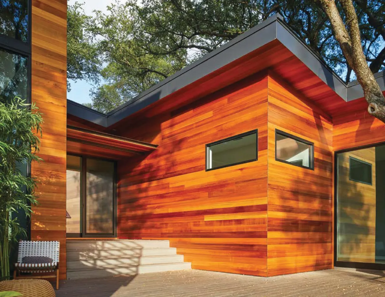
Variations of natural materials are expected to dominate for many years ahead. We started to see natural elements come to the forefront in 2017 with “Greenery,” the Pantone color of the year. The concept of bringing the outdoors in was big in 2017 not only with fashion, but with interior design as well. Jungle print was seen on a multitude of fabric and wallpaper designs often complemented by simple greenery elements like house plants. And yes, planter boxes on home exteriors are gaining popularity. Even exterior trends can have small, exploratory beginnings.
For exterior trends which are more enduring and less likely to change over quickly, interior colors and textures tend to have influence in about two to three years—for siding, trims, gables and outdoor furniture. With Modern Farmhouse slowly morphing and influencing Modern Industrial with its less cozy elements, we would expect some of the natural elements such as earthy stone and wood color schemes to remain, as well as the cleaner lines moving to the outside. Purposeful details are being added to exteriors as well with a focus on the gable by adding corbels, brackets or just accenting it with a different material. And, just as in fashion, when a past trend is revived, it takes on modern elements along with it.
While design trajectories have a nationwide impact on the trade, regional particularities must always be factored in as well. When we choose looks that mimic natural cedar and stone, we consider the uses based on location. For example, Beach House Shake, with its very traditional look is immensely popular in coastal regions and recreational lake areas. However, with this year’s trend towards natural materials and tones, our shake has inspired natural materials to be used as accent pieces across the country.
To further examine this the design trend phenomenon, it is helpful to look back at the early evolution of American home exteriors. In Colonial days, design and color were a matter of practicality—darker colors kept in heat in the winter while smaller windows kept out the blazing sun in the summer. A mix of iron oxide, lead, and linseed oil produced a shaker-red shade and helped protect the clapboard or shingled homes. However, most rural homes went unpainted and faded to a dark gray or sooty dark brown from exposure to air—natural, earthy shades were the result of true weathering. There was little contrast between body and trim because colors were scarce and expensive. The first color swatch published in the U.S. in 1842 included three shades of gray, and three of fawn called “Drab”—not very inspiring!
As Americans became wealthier, homeowners desired more options, and, of course, design concepts often drew inspiration from the owners’ countries of origin—the dawn of our nation’s eclectic cultural mix. As homes became more ornate, color became a status symbol with lighter shades such as white, cream and straw used on the body. For contrast, darker shades were used on trim and doors. Italianate styles—distinguished by exquisite detail pieces—favored neutral grays, tans, ochers, and warm beiges.
The grandeur of the Victorian period saw a wider range of deeper colors and stronger contrasts. Canned paint became mass produced around 1870 and was the turning point for exterior colors (although they contained lead and were very thick and oil-based). The concurring Queen Anne style of features of asymmetry, turrets and angles were doused in vibrant, contrasting colors: yellow with dark green, dark red with olive, light and dark gray-green. Sashes, doors and shutters were dark but colorful: dark brown, deep red or maroon joined the more traditional dark green or black.
Due to the extensive length of the Victorian era—nearly a century—it’s a great example of how fashion and interiors translated to home exteriors. Common identifiable features from the Victorian couture include ruffles, puffy sleeves, and ornate detail on jackets. This carried over to interior design with Persian rugs and detailed fabrics being used on focal furniture pieces. That translated into the elaborate ornamentation of Victorian era home exteriors, a style being recaptured by historical lovers in many restoration endeavors. Fortunately, the trend does appear to have a reverse impact.
Along with a swing back towards natural shades—neutral grays, blues and greens, a monochromatic mixed texture look is emerging, with darker sidings, trim and stone looks, and harbingers of dark on dark. As we had predicted, blue remains a dominant color in its cool tones, and in 2020, several paint and color experts included blues, greens and neutral grays in the 2020 “colors of the year,” including blends of navy and gray. Another interesting trend is the blending of different stone profiles, for example brick and stacked stone. Natural wood or stone looks continue, as Modern Farmhouse blends with the cool tones of Modern Industrial.
Many trends come and go, like avocado kitchens or pink bathrooms, but something that’s clear from analyzing trends over the last few decades is what’s old eventually becomes new again. Anticipating and influencing future trends in color and style evolution provides a competitive edge. Trends will likely continue for natural elements like wood-looks in gables, stone as knee wall and porch cladding and exterior accents. Back to nature is a popular trend for 2020, with sustainability as the underlying theme.
In our Post-modern era, predicting design trends requires product researchers to factor in a mind-boggling number of variables including the blending, transitioning and overlapping of styles. And let’s not forget the powerful influence of home improvement media personalities! To stay relevant, today’s designers, pros and homeowners must process a whirlwind of color and texture choices, which requires constant vigil and a delicate balance of confidence and flexibility.


